A Gamified Online Math Learning Experience
My UX leadership in designing the math learning platform resulted in a highly engaging and effective educational tool, demonstrated by a 90% daily return rate and 93% independent lesson completion among young learners during the pilot
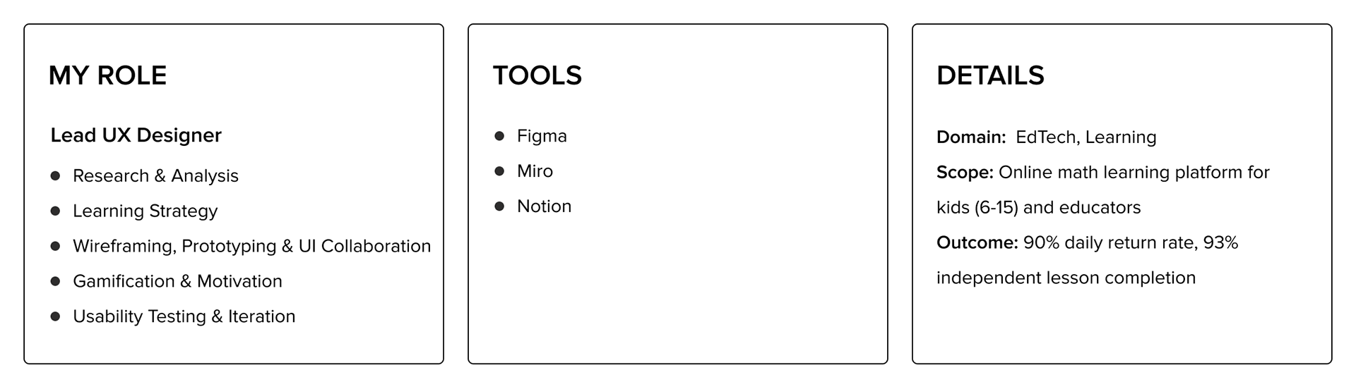
Project Overview
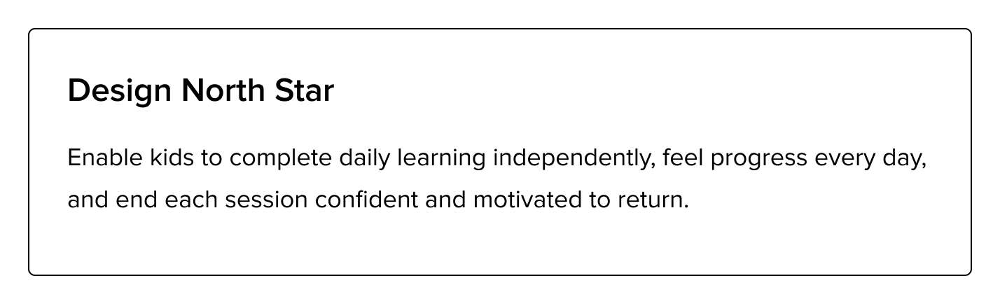
This project involved designing an online math learning platform for kids aged 6-15, accessible across desktop and mobile, and for educators to support learning at scale. The primary challenge was to enable independent lesson completion while maintaining clarity, motivation, and consistency, and providing educators with effective management tools.
The Decision that Mattered
Rather than creating a content-heavy platform, I chose to design around 'small, achievable learning units' with integrated gamification and positive reinforcement, because research showed that low cognitive load and visible progress were critical for independent learning and sustained motivation in children. This trade-off prioritised engagement and habit formation over sheer content volume.
The Problem
The core problem was to design an online math learning platform accessible across desktop and mobile for school-going kids aged 6–15 that supported independent use, minimized cognitive load, while also providing robust tools for educators to manage group learning efficiently. A key challenge was sustaining motivation over time to encourage daily engagement.
Constraints & Challenges
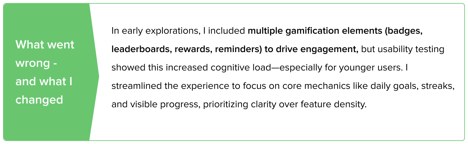
The project was constrained by the need to cater to a wide age range (6-15) with varying cognitive abilities and attention spans, requiring a flexible yet consistent design. Ensuring the gamification elements were genuinely educational and not merely distracting was another significant challenge.
Design Process
Discover · Research & Market Insights
Competitive analysis and early user research examined how leading platforms—Khan Academy, Duolingo, Brilliant.org, BYJU’s, and Udemy—support engagement, progression, and motivation, with a focus on learning structure, gamification, progress visibility, and cognitive load. The research highlighted an opportunity to blend habit-forming motivation with structured micro-learning while addressing gaps in guidance, personalization, and group learning, and these insights—validated through stakeholder and user interviews—directly informed early UX hypotheses around lesson chunking, progress tracking, and motivation-driven reinforcement.
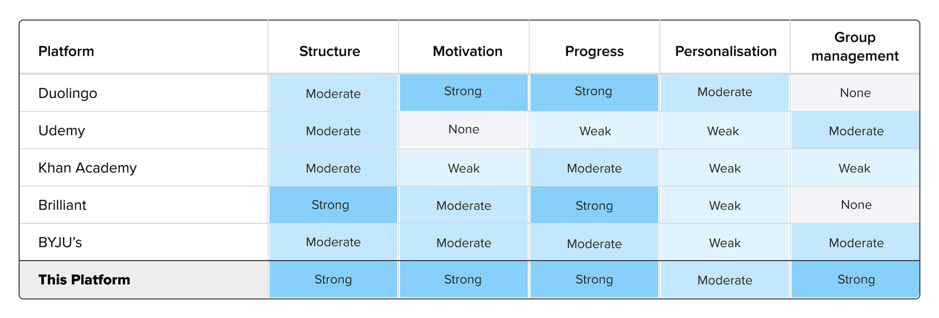
Competitor analysis comparing leading EdTech platforms across structure, motivation, progress tracking, personalisation, and group management to highlight differentiation
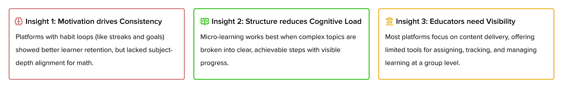
Key research insights highlighting how motivation, structured learning, and educator visibility influence effective math learning experiences
Define · Framing the Right UX Direction
The Define phase translated research insights into clear experience goals using Jobs-to-Be-Done (JTBDs). For kids, the primary job was to complete daily math lessons independently while staying motivated, confident, and willing to return the next day. For educators, the job was to assign content, track progress, and manage group learning with minimal effort.
These JTBDs guided the experience strategy—prioritizing clarity over complexity, reducing cognitive load, and embedding motivation, feedback, and closure into every learning session. From this, a focused set of UX principles was established to steer decisions across lesson structure, navigation, feedback language, and gamification patterns.
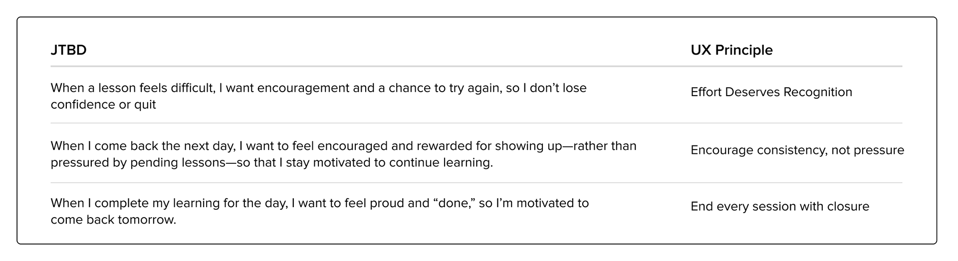
Some of the key Jobs To Be Done (JTBDs) translated into clear UX principles to support learner motivation, confidence, and consistency
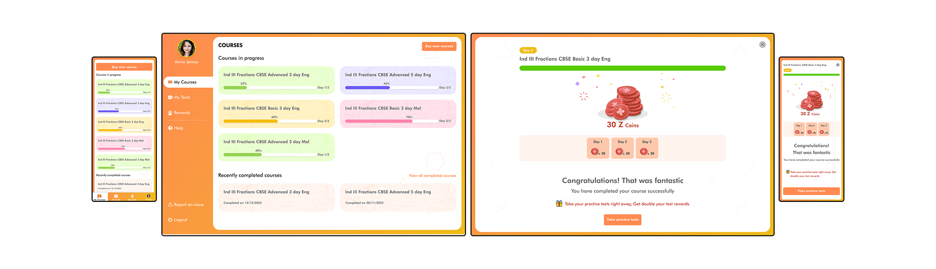
Design · Motivation Through Structure
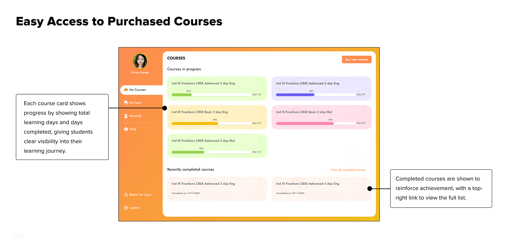
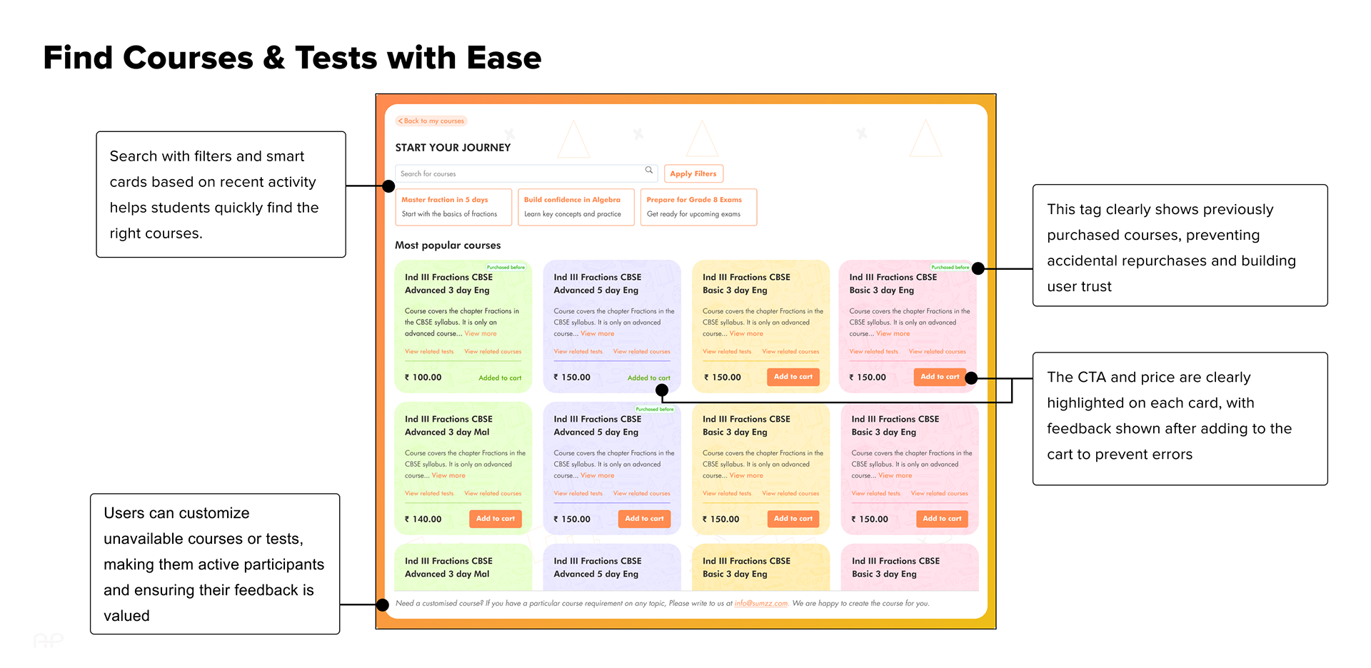
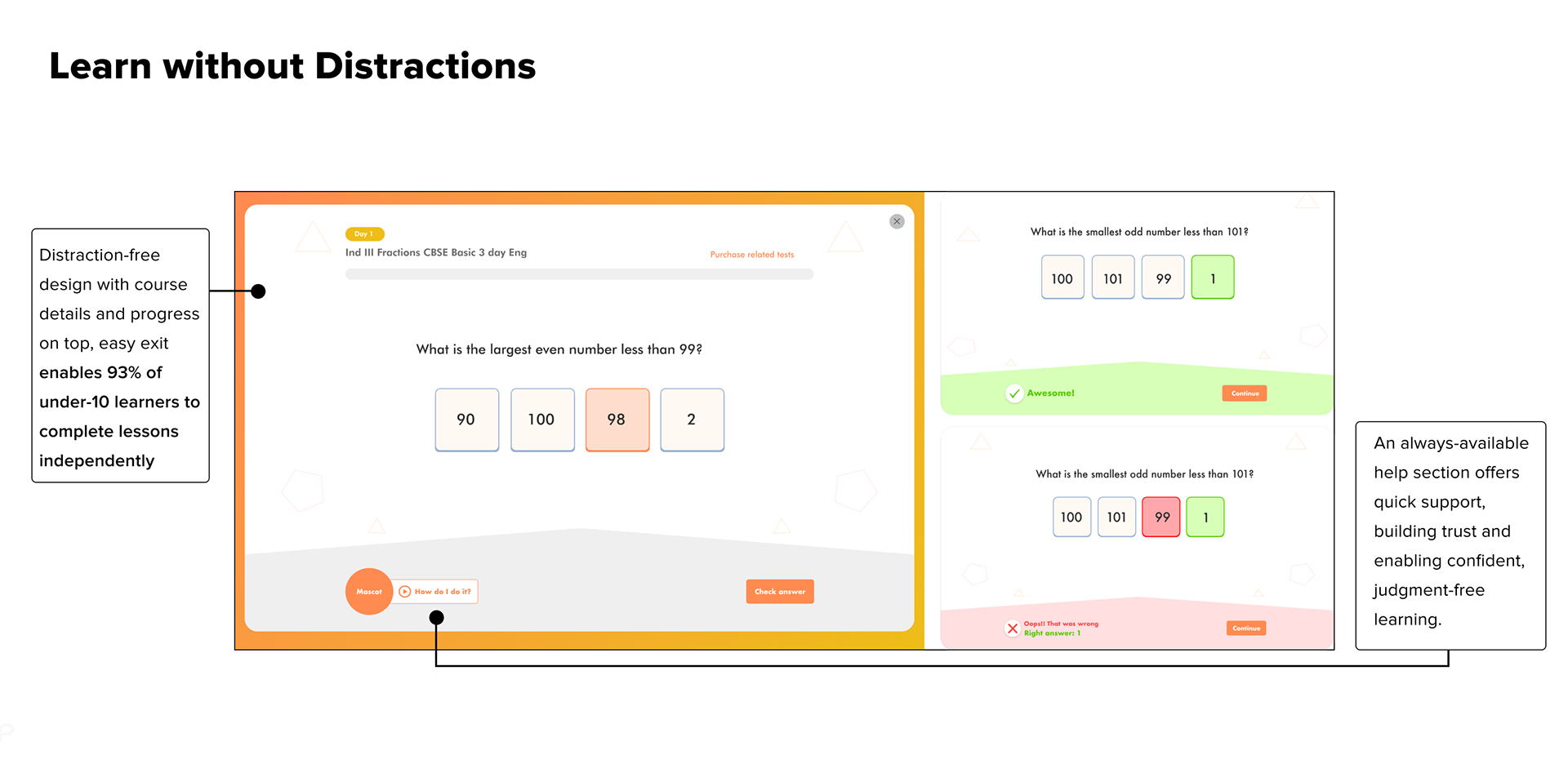
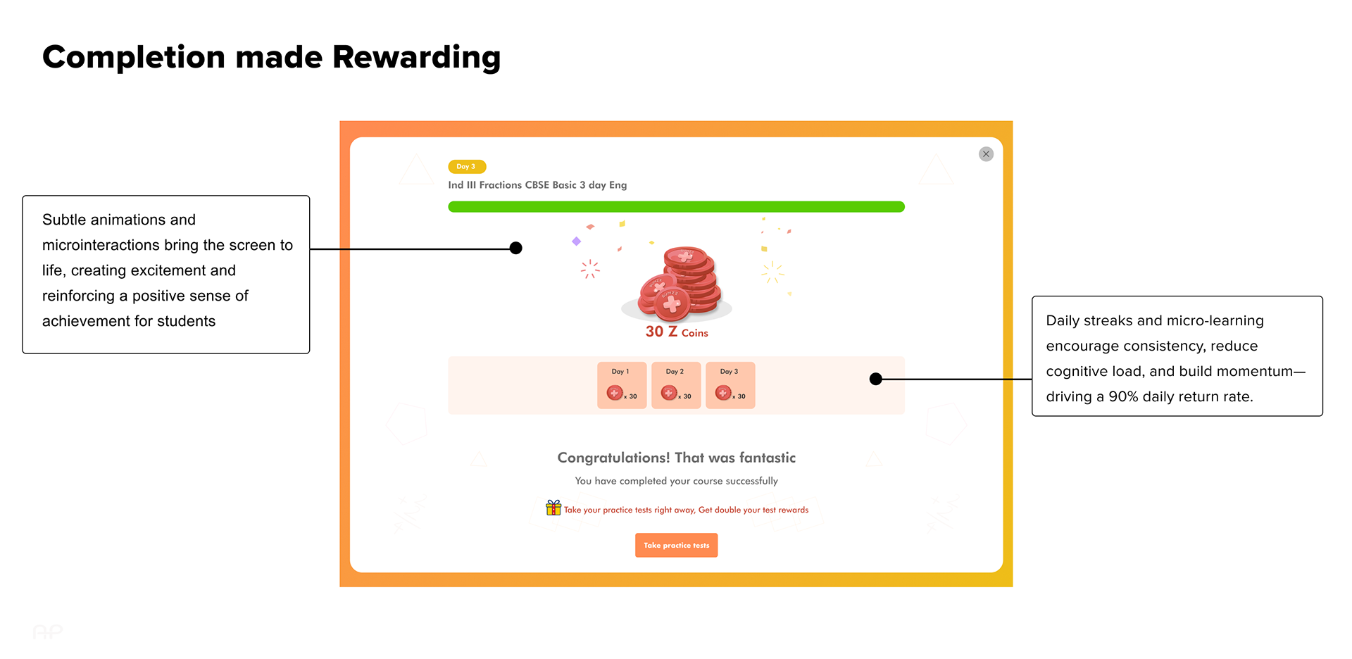
The experience was designed around small, achievable learning units supported by gamification and positive reinforcement. Daily learning goals reduced cognitive load, while progress bars, streaks, coins, and leaderboards made progress visible and rewarding. End-of-day closure was intentionally introduced through a “That’s a wrap for today” message to reinforce completion and encourage return.
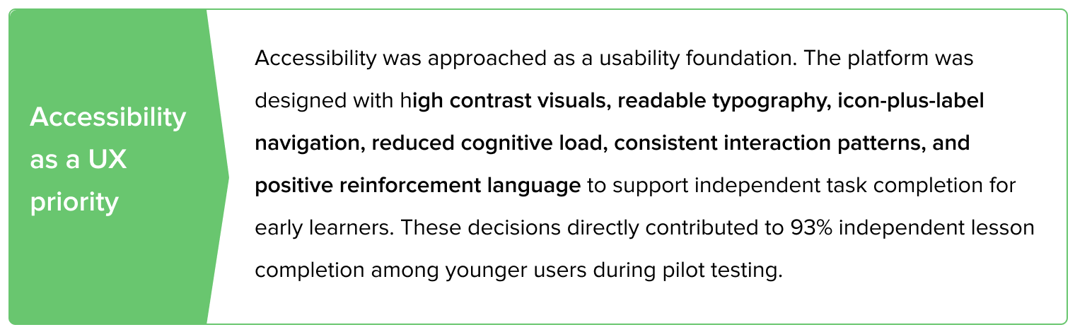
The student interface used age-appropriate typography, simple navigation, and encouraging language to support independent use across ages 6–15. Educator workflows were designed in parallel, with dashboards that allowed easy course assignment, group management, and progress tracking at a glance.
Test · Validate and Iterate
Usability testing with kids aged 6–14 confirmed that even younger learners could independently find courses, start lessons, and complete daily goals. Motivation features—especially streaks and coin rewards—stood out as key drivers of engagement. Educators and tutors validated group management workflows, and their feedback informed iterations that simplified course distribution and reduced friction across both student and educator experiences.
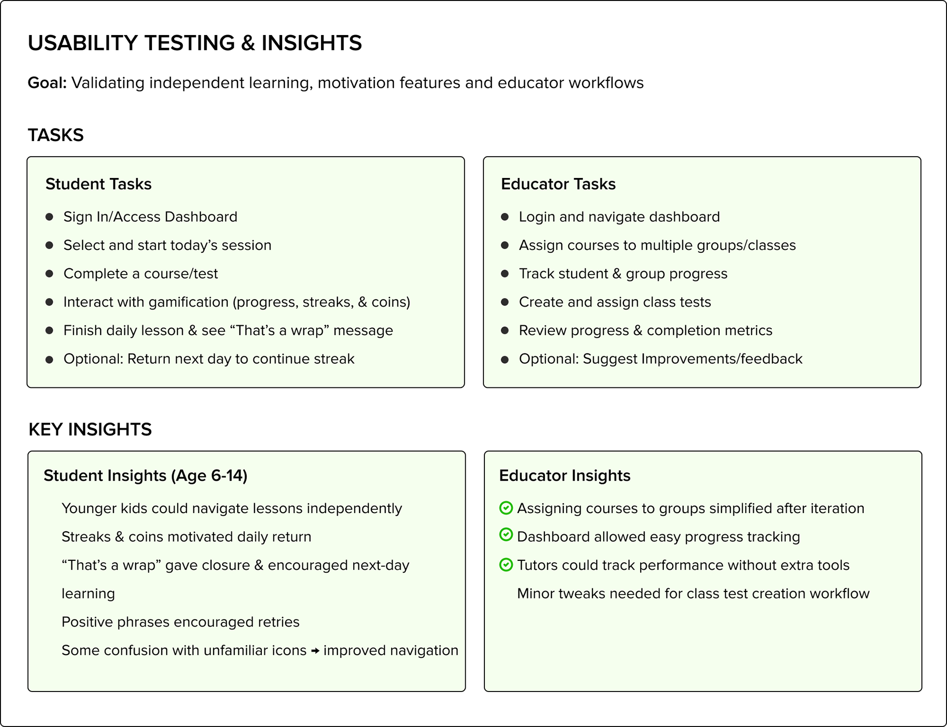
Usability testing overview highlighting key student and educator tasks, goals, and insights that shaped learning motivation and classroom workflows
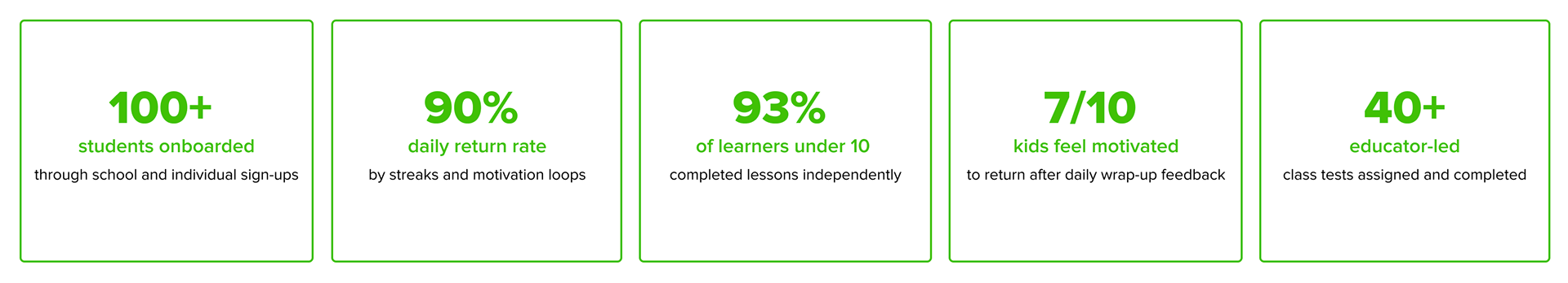
The Outcome
Post-launch, a 3-month pilot with selected schools showed significant success: 100+ students onboarded, a 90% daily return rate driven by streaks, and 93% of learners under 10 completing lessons independently.
Final Reflection
Great UX goes beyond usability—it builds motivation, supports the user’s stage of growth, and encourages lasting habits. This project focused on shaping a learning experience where students felt confident navigating lessons independently, motivated by visible progress, and encouraged to return each day. Beyond delivering content, the work demonstrated how thoughtful UX can turn learning into a positive, repeatable experience—one that supports both learner confidence and long-term engagement.