Designing a Digital Clinic Management Experience
My leadership in this project resulted in a streamlined, user-centered clinic management platform that significantly improved usability, accelerated task efficiency, and enabled seamless adoption through a simple and familiar experience for clinic staff.
Project Overview
This project focused on designing a streamlined clinic management system tailored for small and mid-sized clinics. Existing solutions were either fragmented (spreadsheets and disconnected tools) or overly complex and expensive hospital-grade systems, leading to inefficient workflows and administrative overload. The core challenge was to unify and simplify everyday operations—appointments, billing, staff management, and inventory—into an intuitive digital platform that improved efficiency while eliminating unnecessary complexity.
The Decision that mattered
Instead of scaling down a hospital system, the focus shifted to designing a streamlined, role-based experience built around real clinic workflows. Prioritizing high-impact features for the MVP ensured faster adoption and long-term scalability without overwhelming users.
The Problem
Small clinics relied on paper records, spreadsheets, or disconnected tools, while existing hospital-grade systems were too complex and expensive for their needs. This created administrative overload, limited visibility across operations, and inefficient workflows for doctors and clinic owners.
Challenges & Constraints
The solution had to support multiple roles with distinct workflows while remaining simple enough for non-tech-savvy users. The key challenge was balancing essential functionality with clarity, affordability, and ease of adoption.
Design Process
Discover · Remote Interviews & Ecosystem Mapping
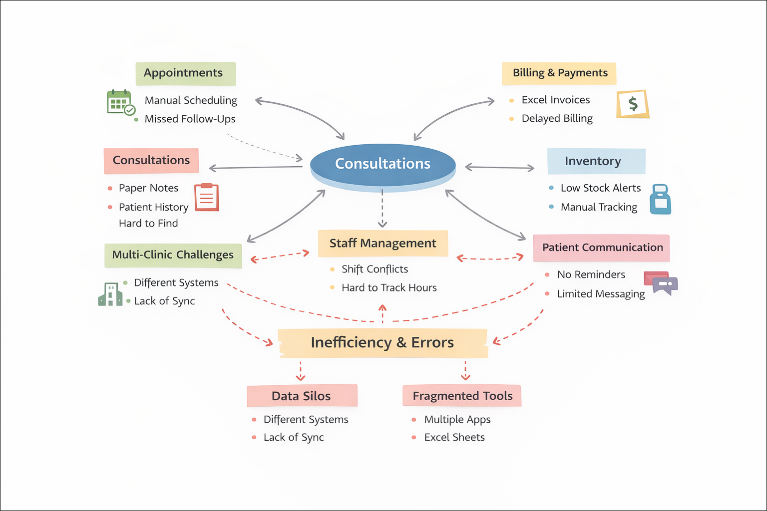
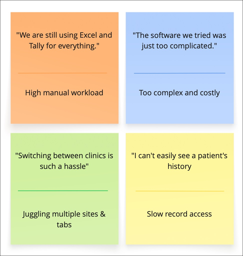
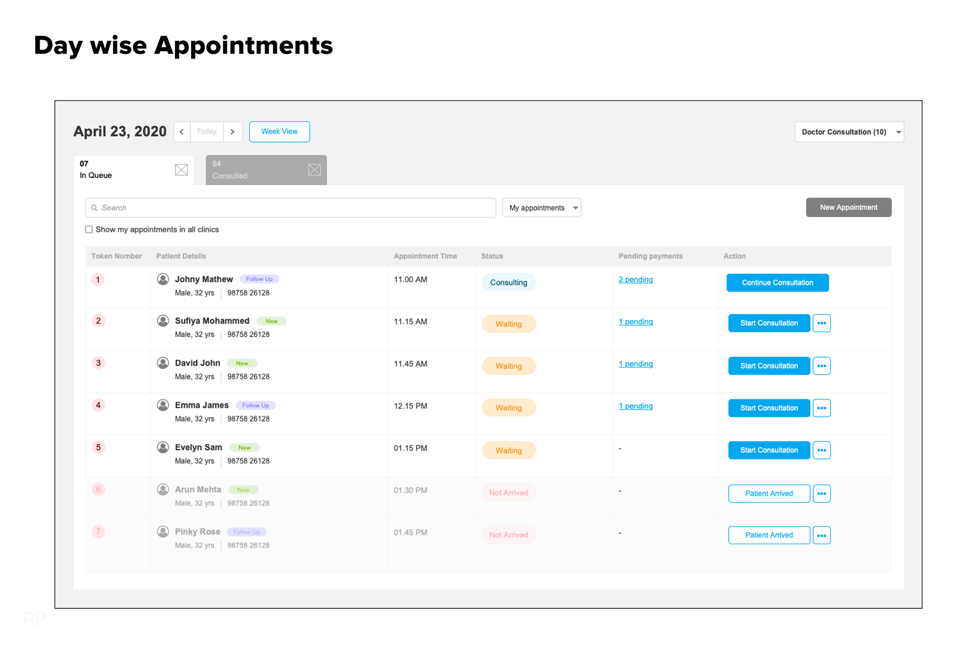
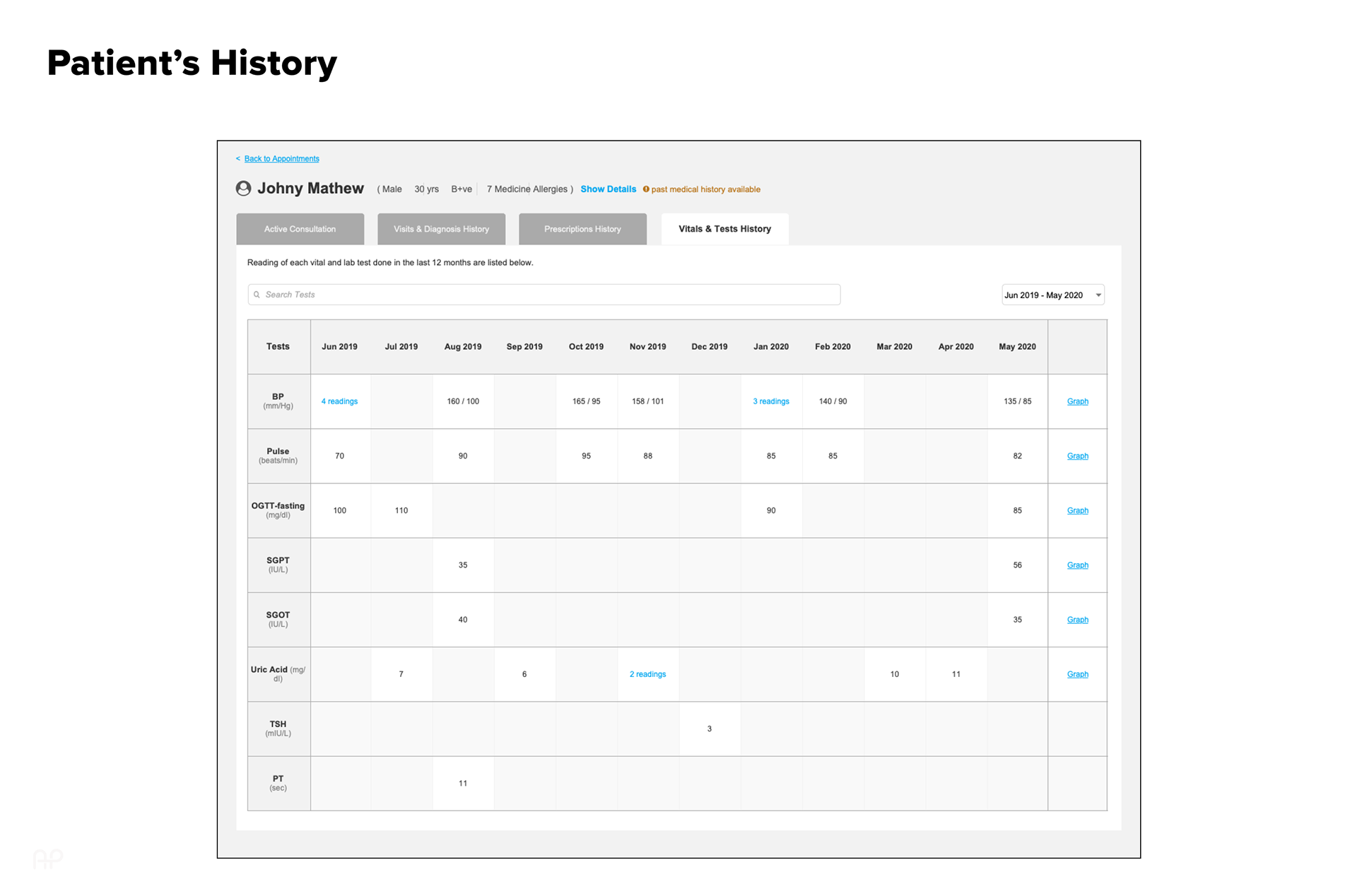
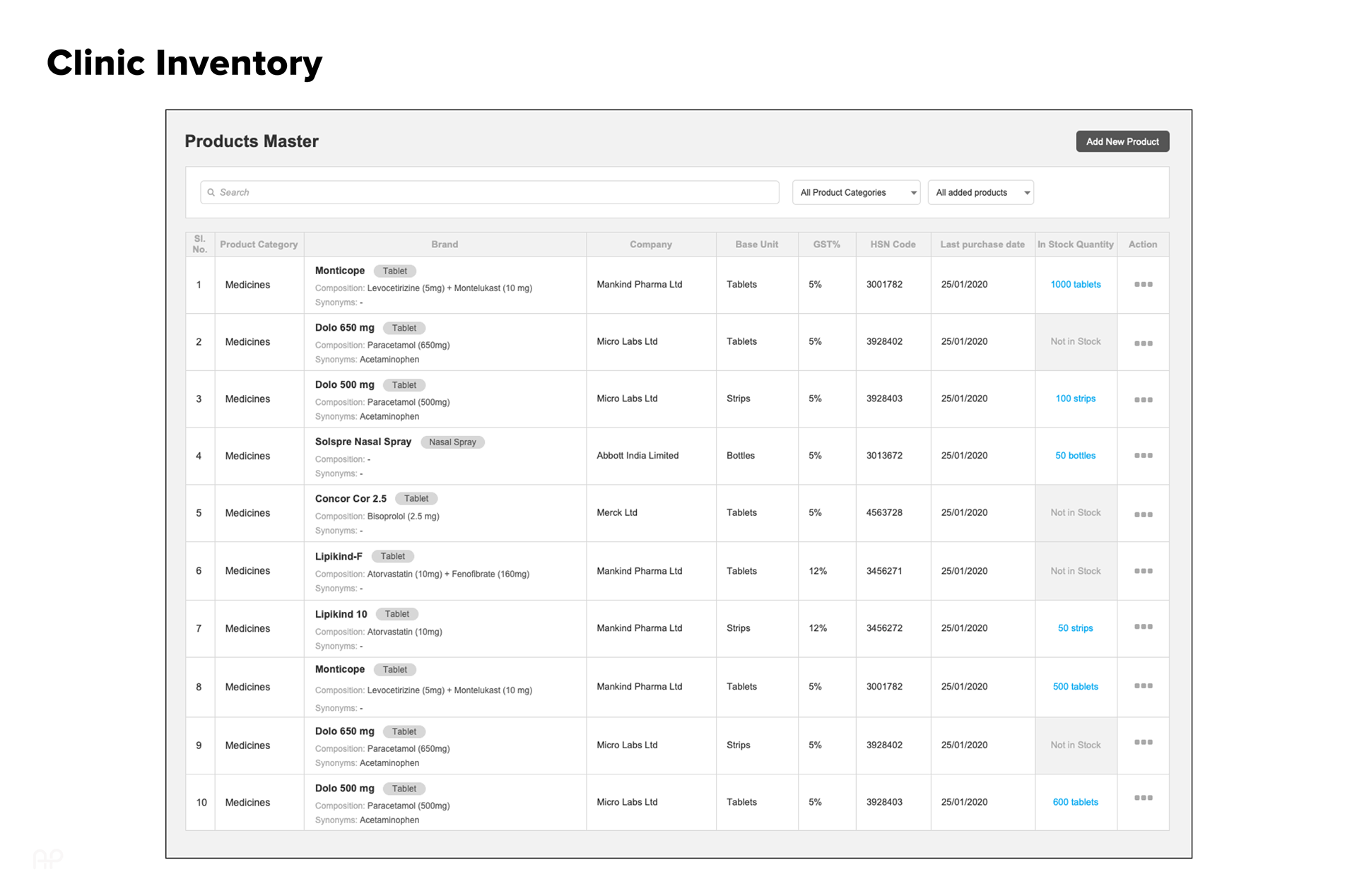
To understand how small clinics truly operate, remote interviews were conducted with 4 doctors and 5 clinic owners to uncover real workflows across appointments, consultations, billing, staff scheduling, and inventory management. The research revealed heavy reliance on Excel/Tally, fragmented multi-clinic processes, difficulty accessing patient history, and resistance toward complex hospital-grade systems. Insights were synthesized into cognitive maps and workflow diagrams to visualize the clinic ecosystem and surface usability gaps between existing tools and real mental models—directly informing system structure and feature priorities.
Define · Framing Opportunities & MVP Scope
Insights from research were translated into structured How Might We (HMW) questions to reframe key pain points into actionable design opportunities.
HMW help a doctor switch between clinics seamlessly?
HMW reduce effort in recurring consultations?
HMW let know the users regarding low stock inventory?
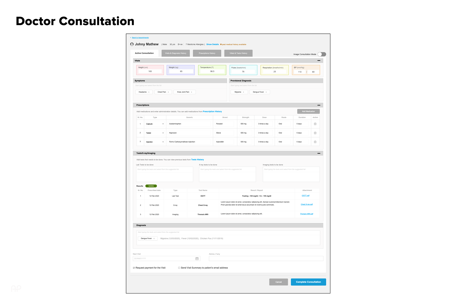
This guided collaborative ideation focused on improving speed, clarity, and multi-clinic workflows. We then mapped role-based user flows to align system behavior with real tasks, followed by feature prioritization (Impact–Effort matrix) to define a focused MVP.

Design · Iterative Exploration & Validation
Design solutions were explored through rapid, low-fidelity iterations, starting with paper sketches to quickly validate ideas generated during ideation. These early concepts focused on solving core usability challenges rather than visual refinement.
Concepts were then translated into low-fidelity wireframes and interactive prototypes in Axure RP, enabling collaborative reviews with product, UI, and engineering stakeholders. Feedback loops ensured alignment and continuous refinement before moving to higher fidelity.
-------------------------------------------------------------------------------------------------------------------------------------------------------------------------------------------------------------------------------------------------------------------------------------
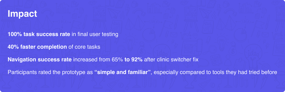
Testing & Iterating with Real People
Every prototype was tested with the same doctors and owners who shared their problems. Their feedback was our compass. Here’s what changed:
✅ Before: Multi-clinic navigation was confusing
After: Introduced a clear, clean clinic switcher
✅ Before: Invoice generation was too long
After: Enabled 1-click invoice from consultation
✅ Before: Purchase & stock mixed together
After: Split workflows with better visual cues
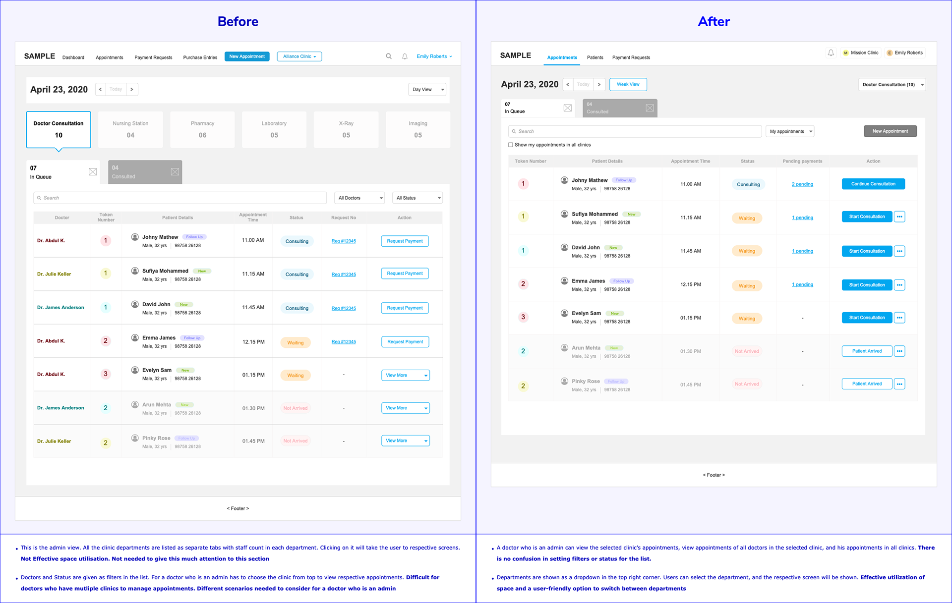
Version 1 and version 2 of department drop-downs and status filters
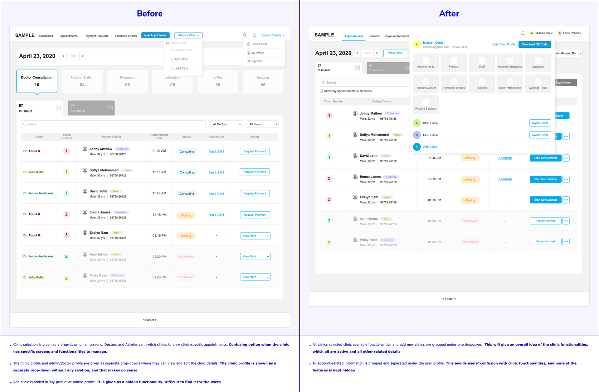
Version 1 and version 3 of clinic selection and clinic functionalities
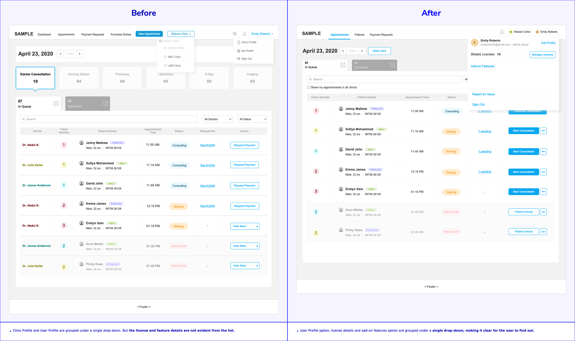
Version 1 and version 3 of the user profile options
-------------------------------------------------------------------------------------------------------------------------------------------------------------------------------------------------------------------------------------------------------------------------------------
Final Reflection
One of the most important lessons I learned was the power of iterative design driven by real user feedback.
Designing this product taught me that real UX success lies not in flashy features—but in solving everyday frustrations, simply and clearly.