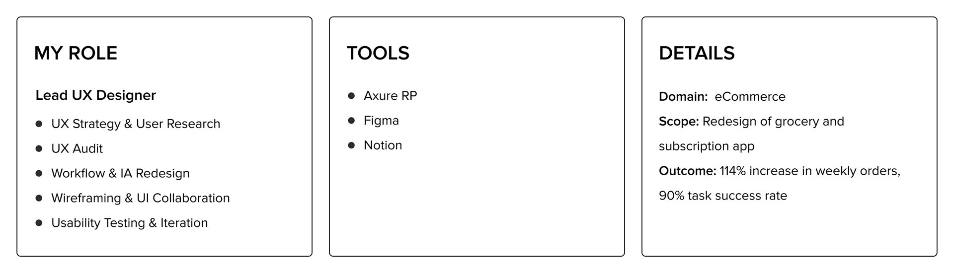
Redesigning a Grocery & Subscription App Experience
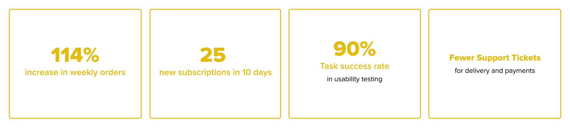
My leadership in the redesign transformed complex subscription and checkout workflows into an intuitive, guided experience, reducing user confusion and driving a 100% growth in weekly orders.
Project Overview
This project involved redesigning an existing grocery and dairy subscription app launched in selected regions in India to gather early feedback. Despite supporting shopping, subscriptions, and peer-to-peer selling, unclear checkout flows, limited subscription controls, and confusing navigation led to user frustration. The redesign focused on simplifying core workflows, restructuring navigation around key user goals, and improving clarity across ordering and subscription management to create a more intuitive experience.
The Decision that Mattered
Rather than jumping into visual redesigns, I began with a heuristic evaluation and UX audit, prioritizing issues by severity and validating them through user conversations and competitive analysis. Instead of applying surface-level fixes, I restructured the information architecture and core flows, validating wireframes before UI—ensuring the redesign solved fundamental usability gaps, not just visual inconsistencies.
The Problem
The app’s initial launch revealed fragmented navigation, unclear checkout flows, and limited subscription controls, creating confusion across critical tasks like ordering, pausing deliveries, and resolving issues. Poor information hierarchy and missing user controls increased cognitive load and task friction, directly impacting engagement, trust, and order completion rates.
Constraints & Challenges
As this was an existing live product, the redesign had to improve usability without overwhelming current users accustomed to the old flows. Balancing meaningful structural changes with familiarity, while ensuring adoption among both existing and new users, was a key change management challenge.
Design Process
Discover · Heuristic Evaluation & Contextual User Research
To understand real usability breakdowns, I led a structured heuristic evaluation aligned with Nielsen’s 10 usability heuristics, alongside in-depth user interviews and product testing with existing users. Through direct observation of task flows—such as subscription setup, checkout, and issue resolution—critical friction points, navigation gaps, and unmet needs were uncovered beyond documented feedback. Synthesizing audit findings with user insights helped surface high-impact usability gaps and establish clear priorities for the redesign.
Most high-severity issues affected primary tasks such as subscription management and checkout, directly impacting order completion and trust.
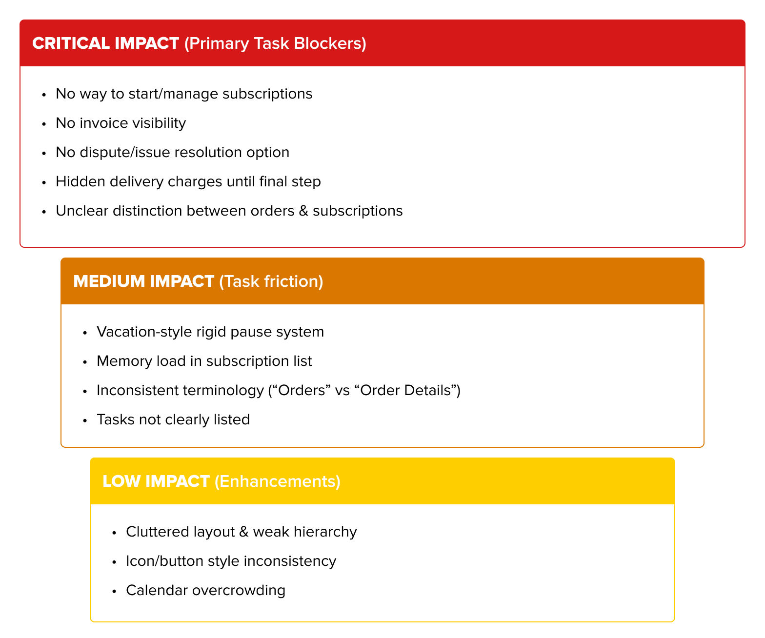
Prioritized Issues based on task criticality and business impact from Heuristic Evaluation
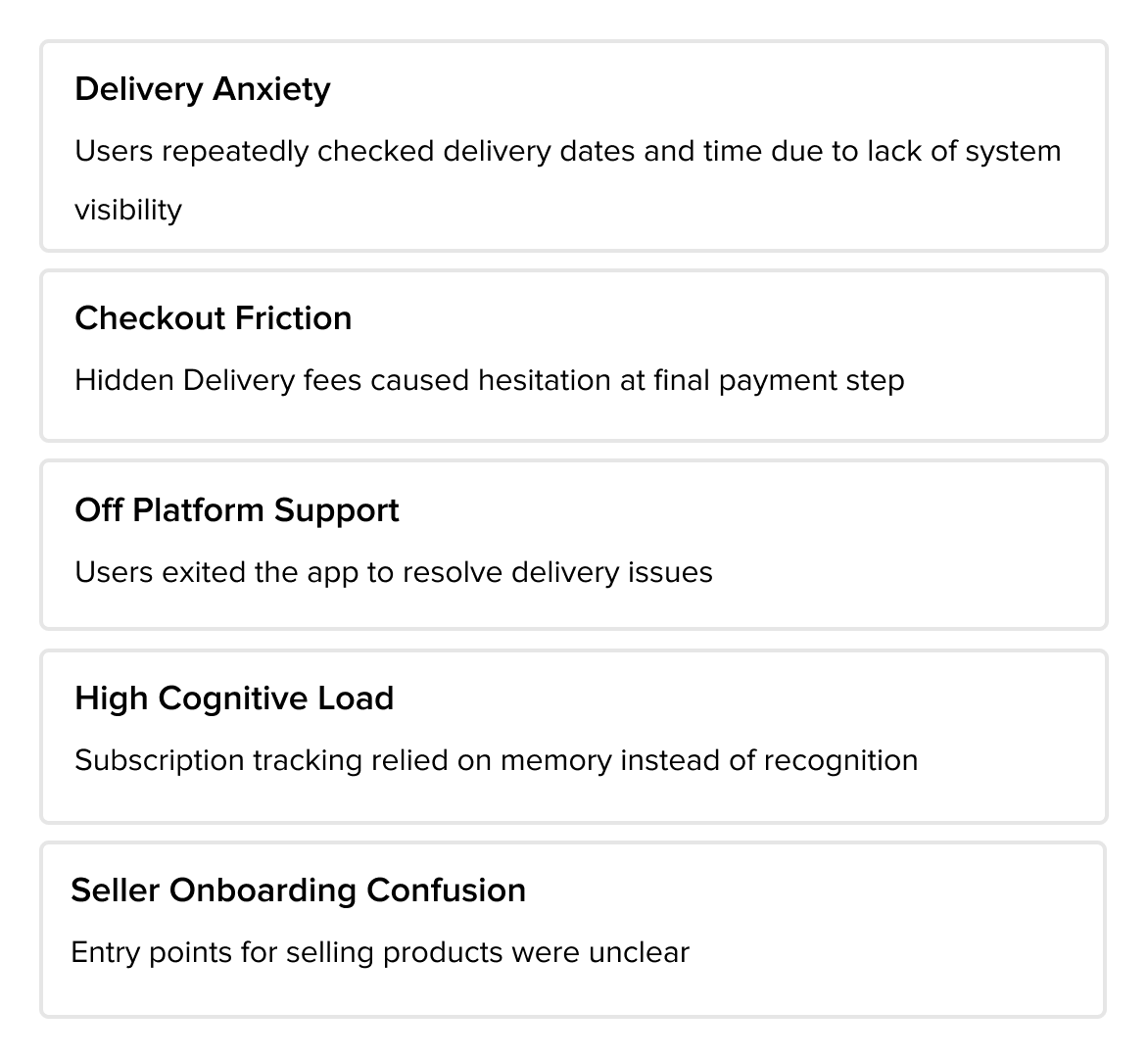
Usage Pattern Insights
Define · Prioritizing Usability Gaps & Restructuring Core Flows
Synthesized audit findings, user interviews, and competitive insights into prioritized usability themes across subscription management, checkout, and post-purchase support. Issues were mapped to primary and secondary task flows, aligning user needs with business goals such as order growth, transparency, and retention. High-impact gaps informed a restructured information architecture and clearer task flows to support scalable, user-centered interactions.
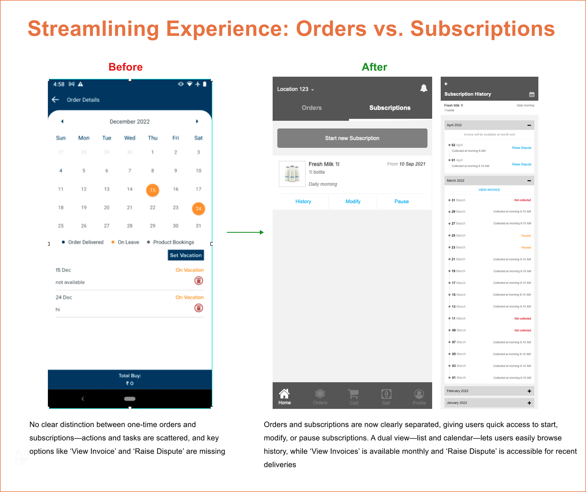
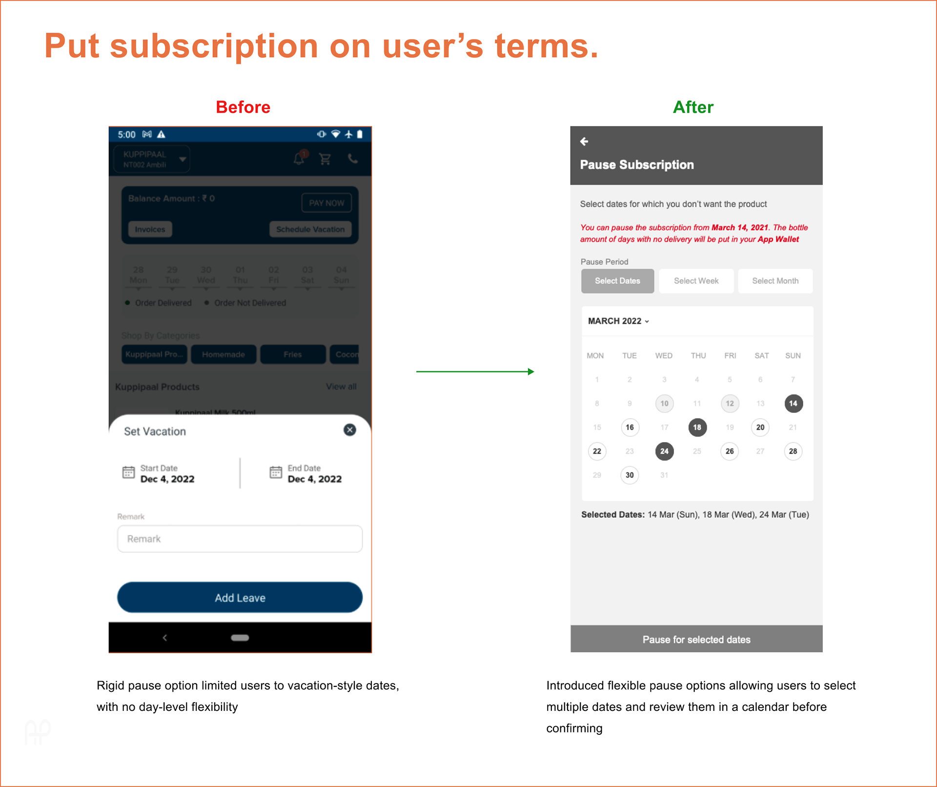
The redesign reduced cognitive load, introduced system visibility, and converted a rigid vacation-based model into a flexible, user-controlled subscription flow.
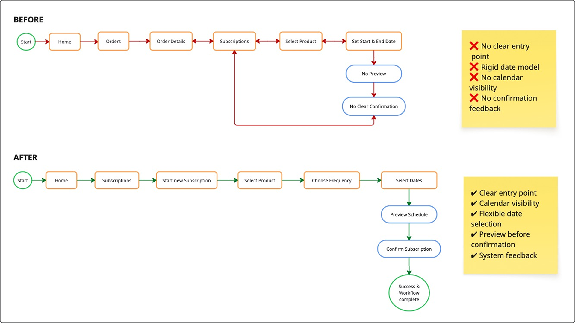
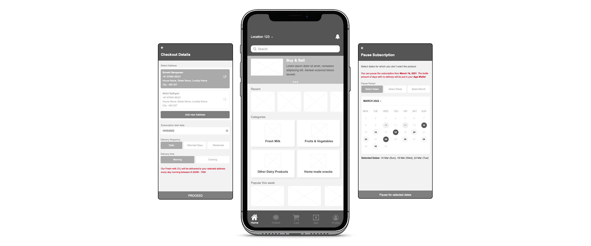
Before and After workflow of Subscription Setup
Design · From Usability Issues to Structure
Design translated prioritized usability issues into clearer task flows and simplified information architecture. Low-fidelity wireframes in Axure validated navigation and checkout improvements before moving to high-fidelity UI in Figma.
Final designs strengthened hierarchy, transparency, and system feedback—improving subscription control, checkout confidence, and overall usability while ensuring scalable, consistent patterns. Accessibility is treated as structural principle, ensuring clarity, predictability, and reducing cognitive load across all workflows.
The original structure mixed subscriptions, orders, and support tasks, increasing cognitive load and navigation friction. The redesigned IA reorganized the system around primary user goals—Shop, Subscribe, Sell, and Support—creating clearer task pathways and scalable growth potential.
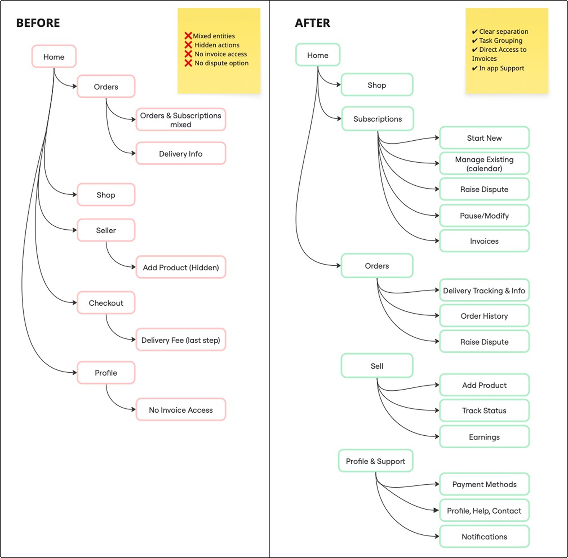
Before vs After Information Architecture
Test · Evaluate and Implement
Evaluation was iterative, with returning users testing redesigned screens across 2–3 refinement cycles. While some resistance to change was expected, feedback was prioritized based on majority patterns and task performance.
We underestimated change aversion, leading to initial resistance. It is addressed through incremental rollout—introducing improvements in small steps, proactively communicating upcoming updates and their value, and supporting users with in-product guidance and transition cues.
The Outcome
Post-redesign, the platform shifted from fragmented experiences to a structured, task-driven system. A newly introduced subscription flow generated 25 new subscriptions within 10 days, while a unified checkout experience doubled average weekly orders. Improved delivery visibility, invoice access, and clearer seller guidance strengthened trust and reduced support friction. The results confirmed that resolving structural usability gaps can directly drive adoption, transaction growth, and operational clarity.
Final Reflection
This project taught me that change isn’t just about better design—it’s about better communication. Users grow attached to even imperfect interfaces. It’s our job as designers to earn their trust while introducing improvements.