Project Overview
With the rise of e-commerce and changes in consumer behaviour, many brands, including startups, have shifted their focus online to stay competitive.
Nature Cradle is a mobile app that has already been launched in specific locations in India to gather user feedback. The app offers grocery shopping features, dairy product subscriptions, and a platform for users to sell their homemade or homegrown items.
Our goal for this project was to enhance the app's user experience by revamping its screens, emphasizing core features, integrating user feedback, and introducing new functionalities.
Industry
E-commerce
Duration
2022
Target Users
Users of all groups — the app is targeted to users in India
Role
I was responsible for revamping the mobile app screens and designing new features. This involved analyzing the user experience of the existing mobile app, conducting user research, incorporating user feedback into design updates, aligning product goals with key stakeholders, creating user flows, drafting sketches and wireframes, and testing the user interface.
The client requested a new design with a more attractive and appealing screen layout than the previous one. Furthermore, they aimed to elevate the milk subscription screens, rendering them more captivating and tailored.
Based on user feedback, we have identified some issues and requirements that need attention:
- The mobile app does not have a feature to initiate a new subscription.
- The app should provide a comprehensive view of all subscriptions, including upcoming delivery dates.
- There is currently no way to contact the app or raise a concern within the app for a specific delivery or subscription.
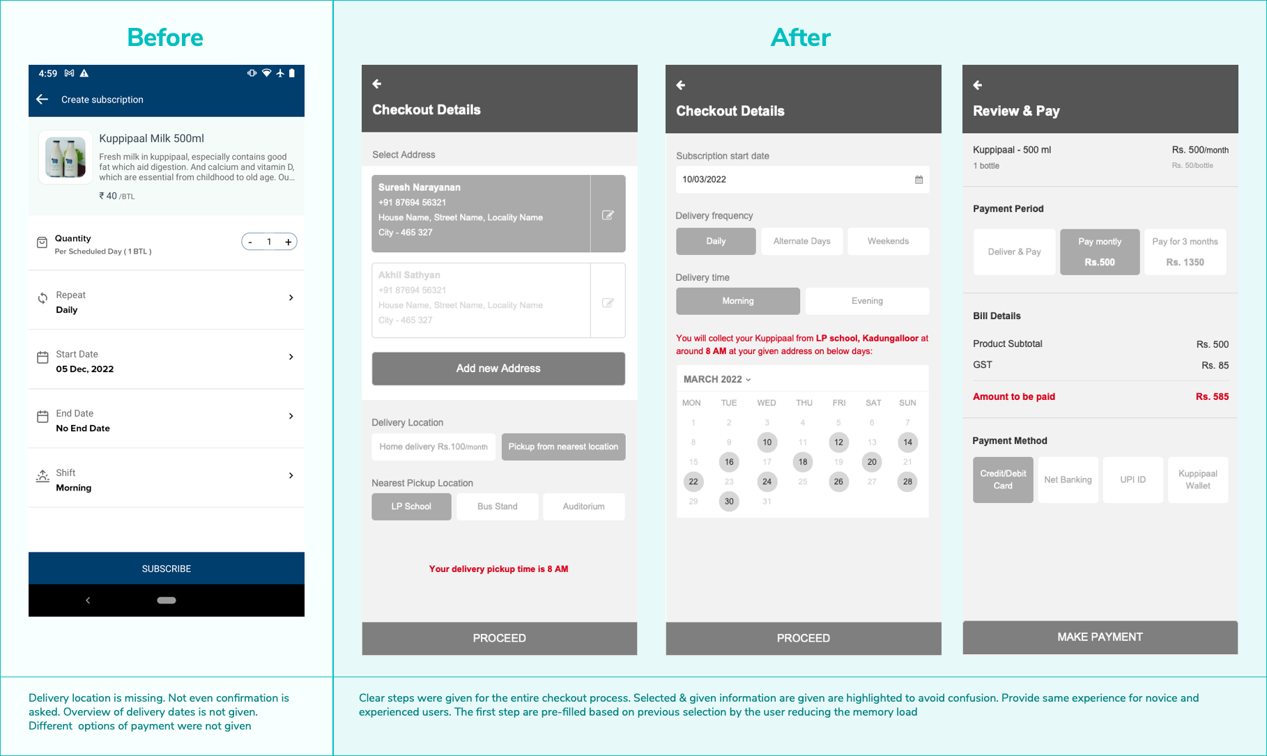
- The checkout process needs improvement, particularly in displaying delivery fees. We also need to establish a unified structure.
Additionally, we need to focus on implementing the following new features into the app:
- An option to view invoices of subscriptions
- A feature for selling and verifying user-listed products (fruits and vegetables)
Revamping a product is a highly intricate task that requires extensive research, planning, and multiple iterations. To begin the process, a kickoff meeting was held with stakeholders, including the client's development and marketing teams. Business objectives, aesthetic preferences, functionality requirements, and target audience were discussed during the meeting, and a timeframe was established.
PS: For this project, we are unable to share any previous designs or artifacts due to an active NDA between the client and the previous software company.
DISCOVER: Competitor Analysis
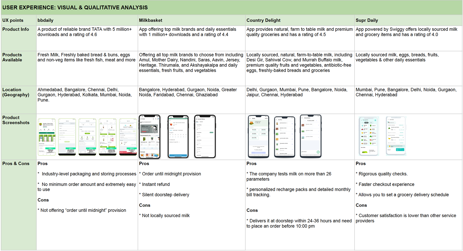
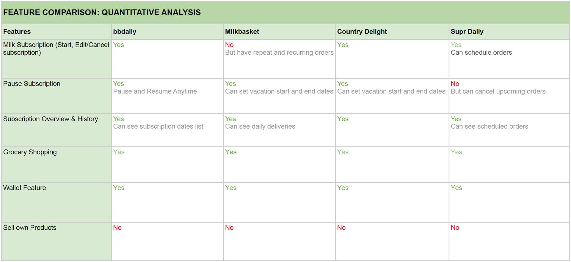
After setting expectations, the first step is to understand the market. This involves researching and identifying competitors to gain insights into market expectations and user needs. Although many grocery shopping mobile apps are available, only a few offer subscription features. To determine the best approach, our team (with me as the UX Designer) selected and compared highly rated mobile apps based on their essential features. See below for the analysis table.
UX Comparison
Features Comparison
DISCOVER & DEFINE: User Research, Testing & Feedback
We reviewed the user research and testing conducted by the previous team, carefully analyzing the feedback and interview questions. To better understand the user process and pain points, we made necessary tweaks to the questions before conducting our own user interviews and product testing. With these updates, we were able to confidently finalize the designs.
Conducted by UX designer, Project Manager, Client Product team
DISCOVER & IDEATE: Deconstruct & UX Analysis of existing design
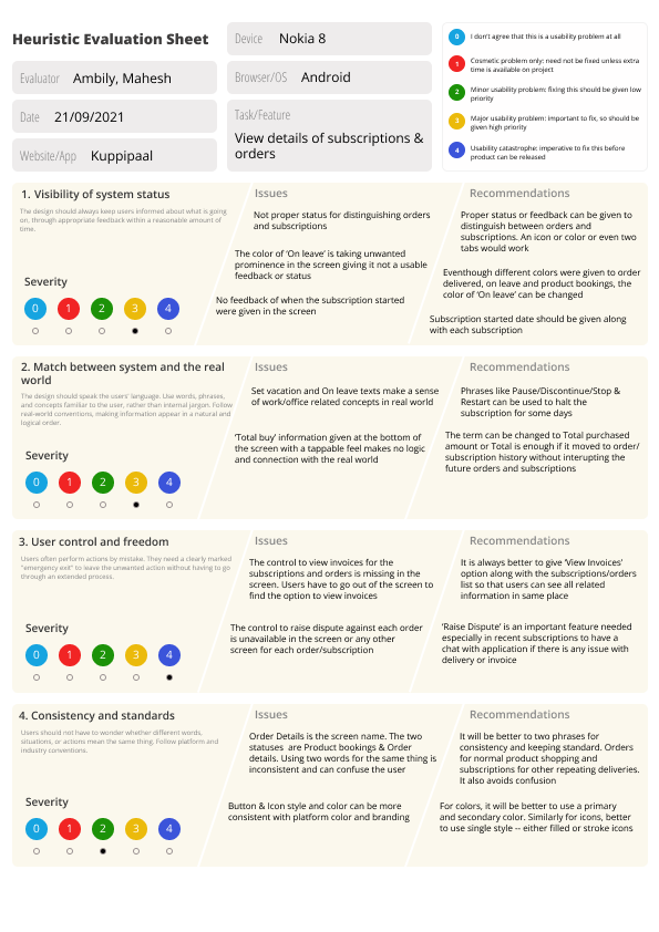
Our team put a lot of thought and research into creating the current design. Our main objective was to carefully examine the design, thoroughly understand each feature and the reasoning behind each decision, and provide better solutions for any user difficulties we discovered. We conducted UX analyses based on standard usability heuristics (NN group's 10 usability heuristics), which helped us identify problem areas. We classified these issues based on the screens affected, which could range from usability problems to navigation inconsistencies, missing feedback, or confusing UI design.
In addition to identifying these issues, we provided suggestions and improvement opportunities for each point based on insights from user interviews and competitor analysis. Finally, we sorted these points based on priority level and the potential impact on the user experience. As the UX designer, I led this effort with support from the client's product team. We've defined three priority levels, represented by three different colours.
Red - High priority points. Affects other tasks of users directly — Primary Tasks
Orange - Medium priority points. Affects other tasks of users indirectly — Secondary Tasks
Yellow - Low priority points. It doesn’t affect other tasks — Good to have the tasks

To explore different ideas that came up during brainstorming, we initially used paper sketches. After a few iterations within the team, we created low-fidelity wireframes for the main screens. Our aim was to implement the solutions we suggested in the analysis table, but we had to change some solutions to align with the other screens. The low-fidelity wireframes were created using Axure RP 9.
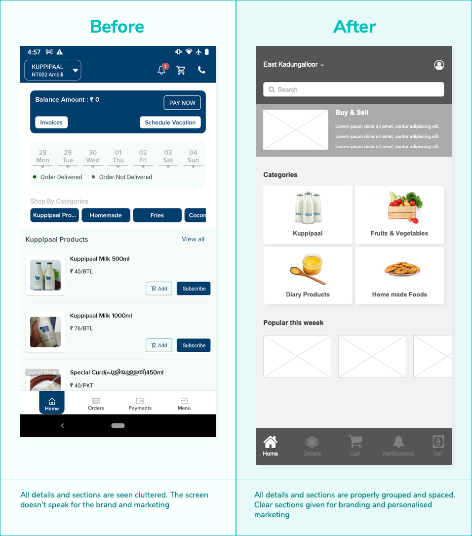
We shared these low-fidelity wireframes with the client product team and collected user feedback for each screen. Based on the feedback, we made iterations on the spot. Below are some before and after screens of the app.
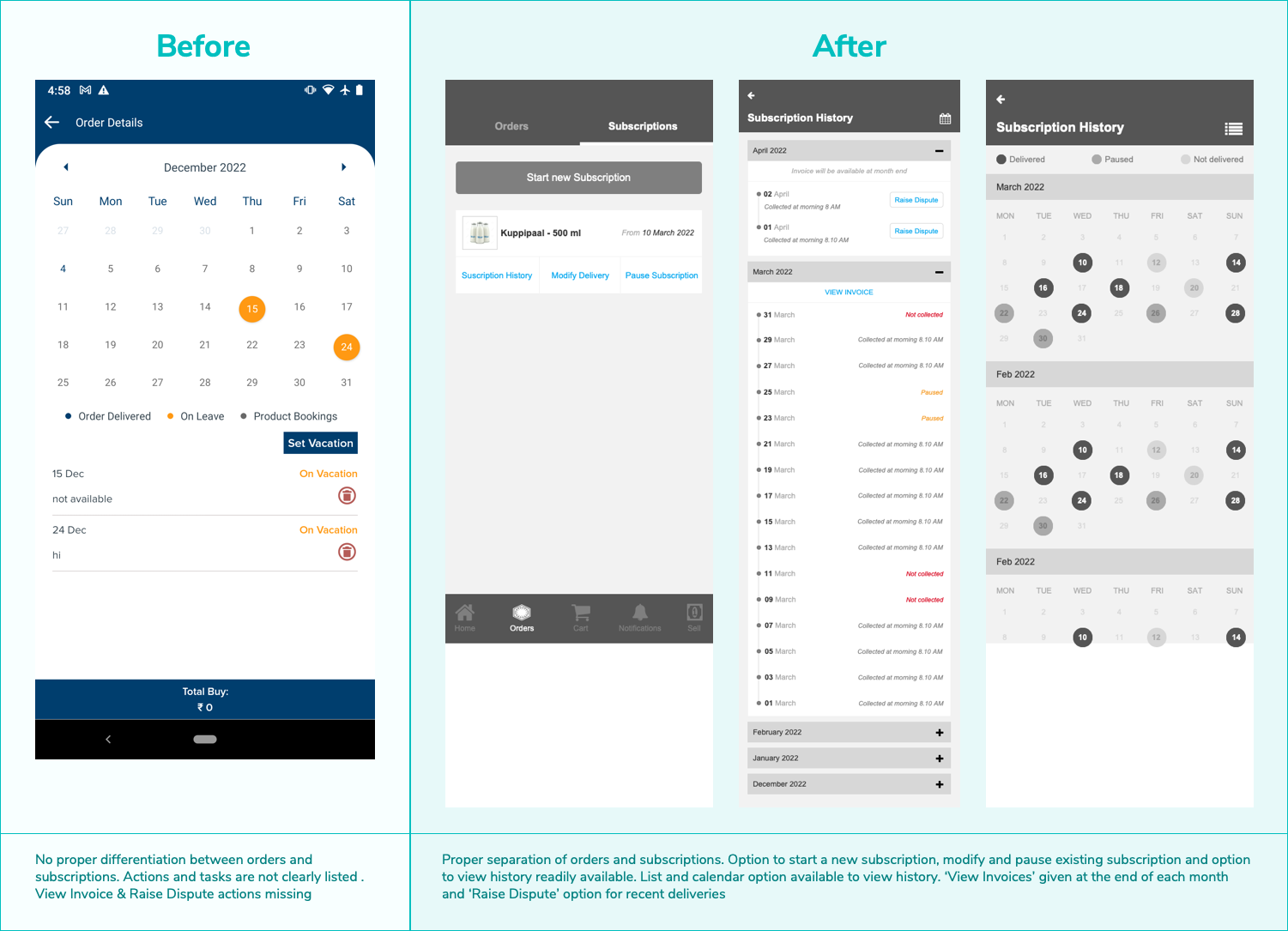
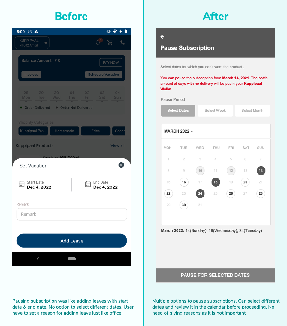
The process of evaluation is ongoing and involves multiple iterations. The users who tested the previous designs were chosen to evaluate the new design. It is normal for some users to feel uncomfortable with redesigned screens and elements. After considering the majority opinion, we made 2-3 iterations to incorporate user feedback.
When implementing a new design, it is important to be cautious, as users tend to resist change even if the original design was flawed. Therefore, adapting to new changes may require a learning curve, even if the new design is an improvement. Monitoring analytics and keeping change aversion in mind,
When implementing a new design, it is important to be cautious, as users tend to resist change even if the original design was flawed. Therefore, adapting to new changes may require a learning curve, even if the new design is an improvement. Monitoring analytics and keeping change aversion in mind,
- We took an iterative approach by implementing small changes at a time
- We kept users informed of any upcoming major changes and explained how these changes would address their concerns through email and in the application
- We provided transition instructions and support in the form of instructional overlays
- We kept users informed of any upcoming major changes and explained how these changes would address their concerns through email and in the application
- We provided transition instructions and support in the form of instructional overlays
Redesigning a product can be both thrilling and nerve-wracking. User feedback can be mixed, with both positive and negative comments. It's impossible to please everyone, but we can focus on the common pain points and improve the overall user experience of the product. Here are a few ways we have seen success with our redesign:
- Adding the ability to start a new subscription in the mobile app was a success. After releasing this update, we saw 25 new subscriptions within ten days.
- Since updating the checkout process, the average number of orders per week has increased from 7 to 15.
- Since updating the checkout process, the average number of orders per week has increased from 7 to 15.
